Exercise 1 - Web Anaylsis
25/09/2024 - 5/10/2024
Diane Sani Alexander Wan / 0378712
Interactive Design / Bachelor of Design (Hons) in Creative Media
Exercises
1. TASKS
Week 2:
Exercise 1 - Web Analysis
We need to pick 2 websites that were given in Google classroom and then interpret the websites and see how it impacts the user experience. We have to consider the purpose and goals of the website and identify the strengths and weaknesses of the website.
WEBSITE ANALYSIS
Awwwards
- https://www.awwwards.com/
After some exploration on this website and scrolling through, this website targets UI/UX designers as the main purpose of the website is to show the 'site of the day' and also the 'site of the month'. You are able to gain inspiration from this website and also purchase a design you desire. They also offer a wide range of courses for those that want to learn more and increase their skill and knowledge.
Content
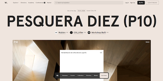
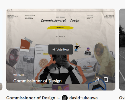
The website itself is also visually aesthetic, so it relates to how relevant the website is to. The website is updates everyday to showcase the site of the day on its front page as soon as you enter the website. It goes into detail about what the creators used for their website like the typography, color and a brief description on about their website. You are able to vote on the nominees section of the website when you hover over which site looks appealing to you.
Design
Everything in this website is symmetrically aligned. The 'site of the day' title is in huge letters in the center to make it the audiences main focus is on that. The colors matches what the site of the day uses so it fits their scheme, which I find very satisfying to look at. Categories are also easy to locate which is at the top left hand corner. They mostly use a sans serif font, it makes the site look clean and neat. there is also a little bar at the bottom to help you on what you want to look for specifically, depending on which category you click on it changes.
Accessibility
As soon as I entered the website, everything loaded up smoothly. The purpose of this website is to see the site of the day and site of the month, and most of it is right in front of you, it makes it easier for the user to navigate the website. Additionally, they put specific scores at the bottom of the website, assuming to let know what other creators know what to look for in the future. Through other devices like the phone, it also the same as the computer, easy to navigate. Loading time really depends on the Wi-Fi you have as I feel like the website carries a lot of little animations like fading in as you scroll down.
Figure 1.2 Scores on the site of the day.
Figure 1.2 Bar of categories to help you.
The Webby Awards
- https://www.webbyawards.com/
When looking through the website, it mainly focuses on digital arts in general. It has a wider range of audience for those that also want to look for inspiration and do some exploration. They do annual entries, so it holds a bigger title.
Content
This website showcases a lot of different things. For example, you can look through the winners of the pervious years entries, it seems like they keep the website up to date as well. It mentions when the deadline is for those that are interested in entering. Shows highlights of moments during their show in person, so users can look back at what they missed on. There are many things to explore on this website like featuring guests.
Design
In terms of designing, the website has a really simple color scheme to it, it mainly falls onto just dark grey overall. When placing 'The latest from the Webbys' and the other 2 down below. it isn't places symmetrical, so it looks a little un-balanced. The fonts used are easy to read but I personally think its a little small on the sections you can drag across.
Accessibility
The website is pretty easy to navigate through. At the top there is categories that can lead you to what your specifically looking for. When you click into winners there are more categories on the left hand side on which leads to which type of field you're looking for, also when a user just hover over one of the categories it shows a more in-depth of which specific field of winner a user is into.
Figure 1.5 The front page of the webby awards website.
Figure 1.8 Browsing by winners.
Figure 1.9 Categories when you browse by winners.
Figure 1.10 More specific categories on which winners.
Week 3:
Exercise 2 - Web Replication
We had to pick 2 given websites and replicate them by following the dimensions of existing websites by width and height. This will help us develop our design skills in Adobe Illustrator and gain insights into web design best practices.
Website: Ocean Health Index
This is a side-by-side comparison with the original website. We had to pick one to do during class and complete it at least once. I used Adobe Illustrator to recreate it. The one on the Left is the original website, and the one on the Right is the replicated one.
Figure 1.12 Side-by-side comparison of the Ocean Health Index website.
Website: Morgan Stanley
The second website I replicated. I also did this on Adobe Illustrator and had to make sure every image was in the same exact size. The left is original and the right side is the replicated one.
2. INSTRUCTIONS
<iframe src="https://drive.google.com/file/d/1SWAAntgneHY9KlKiw-ndmpzIMaKxLoZk/preview" width="640" height="480" allow="autoplay"></iframe>
Exercises: Web Analysis, Web Replication & HTML, CSS Document Development (20%)
Learning goals
- Technical and digital media competencies - Demonstrate creative use of software, and effective use of digital media skills to promote or communicate design concepts or solutions.
Timeframe: Week 01 - Week 06
3. REFLECTION


Comments
Post a Comment