Task 2: Interaction Design Planning and Prototype
22.10.2025 - 05.11.2025 (Week 5 - Week 7 )
Diane Sani Alexander Wan / 0378712
Advanced Interactive Design / Bachelor of Design (Hons) in Creative Media
Task 2: Interaction Design Planning and Prototype
TABLE OF CONTENT
1. Lectures
2. Instructions
3. Task 2
4. Feedback
5. Reflection
LECTURES
Week 5
In todays lecture, Mr. Shamsul taught us the basics of animating like creating the character or object and taught use how to move specific parts. Graphic symbol
Week 6
We learned how to use masking in Adobe Animate and create a simple animation for the website. For example like a box animation around the text to create a smooth animation and understand masking.
Week 7
In this class, we learnt how to create a simple button on adobe animate and using wizard for action. During this class, it took me a while to understand how to make the button. But after a few tries and trial and error, I managed to get the task done.
INSTRUCTIONS
TASK 2
Week 5
I started off by making the wireframes and understanding the placement for each object. Since I'm inspired by the cut and paste look, I had to find for images and cut out each image in Photoshop.
Reference for how I want the slices of bread to fall of. Here
Week 6
Still continuing working on my prototype and bettering it on Figma. Understanding where I want to place the animations for my site.
Week 7
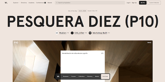
I had to find for a few examples of how I want my animation to look like. There were a few struggles to thing about how I want the buttons to animate into.
Access to prototype presentation here. FEEDBACK
Week 5: Make sure to understand the composition for the website.
Week 6: To not over crowd the whole page so it doesn't look messy.
REFLECTION
Throughout this task, I wasn't sure on how I want my website to look like or how I want the animations to be like, but after many examples and research I gained a few inspiration on the overall look of it. I wanted it to be be fun and interesting with a good amount of information in the website. I didn't want anything too complicated as well and that is easy to navigate. I have to enhance the composition and make it better and understand more about the design hierarchy to make the overall website look neat and presentable.


Comments
Post a Comment