Typography Task 1: Exercises
24.9.2024 - 21.10.2024 (Week 01 - Week 06)
Diane Sani Alexander Wan / 0378712
Typography / Bachelor of Design (Hons) in Creative Media
Task 1: Exercises 1 & 2
Diane Sani Alexander Wan / 0378712
Typography / Bachelor of Design (Hons) in Creative Media
Task 1: Exercises 1 & 2
TABLE OF CONTENTS
3.1. Research
3.2. Ideas
4. Feedback
5. Reflection
1. LECTURES
WEEK 1
Typo_1_Development
- Went through the rules and advice instructions as well as the MIB to understand what assignments and final projects will be done this semester. Knowing the subject outline and expectations for this module.
- Mr. Vinod, gave us pre-recorded videos on how to create an e-portfolio on Blogger and then gave us a link to a playlist where we had to watch lectures 0-1. Lecture 1 was about the history of typography and understanding letterforms.
- Typography is the type of art and technique of arranging letters to make them clear and readable in their written language.
- Fonts are specific styles of letters displayed.
- Typefaces is a family of fonts/complete sets of characters.
Early Development
Disclaimer: All the information here is written from the perspective of the Western world, which tends to overlook inventions in Asia.
Phoenicians were an early letterform development. The Greeks made a style of writing called boustrophedon, which meant the writing went from right to left and left to right. When the directions changed, so did the orientation of letterforms.
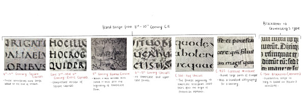
Figure 1.1 Handwritten timeline of development throughout the 3rd-10th Century C.E.
Figure 1.2 Text type classifications from 1450-1990.
WEEK 2
Typo_3_Text P1
Kerning:
- automatic adjustment between the letters.
Letterspacing:
- This means to add space between the letters.
Tracking:
- The addition or removal of a word or sentence.
Uppercase letters tend to look more presentable when the letterspacing is wider.
Formatting text
- Flush Left is a type of format. Each line starts at the same side but ends wherever the last word ends on the line, which means it has a ragged right. The spaces between the words are consistent throughout the text.
- Centered text is a format that is symmetrical. This line sits in the center of the paragraph. The equal value and weight to both ends of the line. It has a ragged left and right.
- Flush Right is the format that places emphasis on the end of the line as opposed to its start. It is usually used when you have pictures when having captions. This format has a ragged left.
- Justified is like centering, but it's more symmetrical in its shape on the text. Resulting to the openness of lines can produce rivers of white space.
Leading and Line Length
Type size:
- The text should be large enough to read easily at arm's length.
Leading:
- Text that is set too tightly gives off vertical eye movement: The reader can lose its place. A type that is set loosely creates stripped patterns that can distract the reader.
Line length:
- Just enough text for the length of the line to be leading for the reader. The rule of thumb is to keep the line length between 55-65 characters. Long or short lines impair reading.
WEEK 3
Typo_3_Text P2
In the pre-recorded video, the first part was just a summarization of the last video. This lecture is based on paragraphs and ways to indicate paragraphs. There were also examples in InDesign on examples shown below.
Text/ Indicating Paragraphs
The Pilcrow is a holdover from medieval manuscripts seldom used today. It is an option for indicating paragraphs.
The example below shows line spacing (leading) between the paragraphs.
Text/ Widows and Orphans
In typesetting, widows are single lines of text in a paragraph that appear alone on the top of the next page, whereas an orphan is a short line of text left alone at the bottom of a page at the start of a new column.
Text/ Highlighting text
When having a large amount of text, there a specific points in the paragraph that mention important information, and a way to do that is to highlight a paragraph in Italics or increase the boldness of the text body.
Figure 1.5Sans serif font has been reduced by 5 to match the x-height of the serif typeface.
Text/ Headline within Text
- A head shows a clear break between topics within a section. A Heads are set larger than the text in small caps and in bold.
- The B Head is subordinate to the A Heads. B Heads shows a new supporting argument for the topic at hand. They do not interrupt the text as strongly as A Heads do.
- The C head is not as common as the others. Highlights specific facets of material within B head text. They do not materially interrupt the flow of reading. C heads in this configuration are followed by at least an em space for visual separation.
WEEK 4
Typo_2_Basic
- Baseline is the imaginary line is the visual base of the letterforms
- Median is an imaginary line that defines the x-height of the letterforms.
- X-height is the height in any typeface of the lowercase 'x'.
- Stroke in any line that defines the basic letterform.
- Apex/ Vertex is the point created by joining two diagonal stems (apex above and vertex below)
- Arm is a short stroke off the stem of the letterform, either horizontal (E, F, L) or inclined upward (K,Y)
- Ascender is the portion of the stem of a lowercase letterform that projects above the median.
- Barb the half-serif finish on some curved strokes.
- Beak The half-serif finish on some horizontal line.
- Bowl The rounded form describes a counter. The bowl may be open or closed.
- Bracket The transition between the serif and the stem.
- Cross bar The horizontal stroke in a letterform joins two stems together.
- Cross stroke The horizontal stroke in a letterform that joins two stems together.
- Crotch The interior space where two strokes meet.
- Descender Anything below the baseline, the portion of the stem of a lowercase letterform that projects below the baseline.
- Ear The stroke extends out from the main stem or body of the letterform.
- Em/en Refers to the width of an uppercase M, and em is now the distance equal to the size. An en is half the size of an em. Most are described as em/en spaces and em/en dashes.
- Finial The rounded non-serif terminal to a stroke.
- Leg Short stroke off the stem of a letterform, either at the bottom of the stroke (L) or inclined downward (K, R)
- Ligature The character formed by the combination of two or more letterforms. When the letterform clashes and looks like it becomes one typeface.
- Shoulder The curved stroke that is not part of a bowl.
- Spur The extension articulates the junction of the curved and rectilinear stroke.
- Stress The orientation of the letterform is indicated by the thin stroke in round forms. When you write by hand the letter is usually slightly slanted.
- Swash The flourish extends the stroke of the letterform.
- Terminal The self-contained finish of a stroke without a serif.
- Uppercase Capital letters that include certain accented vowels, the C cedilla, and n tilde, and the a/e and o/e ligatures.
- Lowercase Lowercase letters include the same characters as uppercase.
Small Capitals Uppercase letterforms draw to the x-height of the typeface. Small caps are generally found in serif fonts as part of what is often called an expert set.
Figure 1.6 Small capital uppercase.
Uppercase Numerals are called lining figures as well, these numerals are the same height as upper case letters and the kerning width are all set the same.
Lowercase Numerals are called old-style figures or text figures. These numerals are set to x-height with ascenders and descenders.
WEEK 5
Typo_5_Understanding
Figure 1.7 The different types of contrast.
Letter/Contrast
Contrast is a powerful dynamic in design, and it's the basic principles of Graphic Design to typography. You can combined different type of contrast to create different aspects of text.
2. INSTRUCTIONS
<iframe src="https://drive.google.com/file/d/1-F6GsP6UpMEkMy1QJZS-obz5wSiPl3Yd/preview" width="640" height="480" allow="autoplay"></iframe>
Task 1: Exercises (20%)
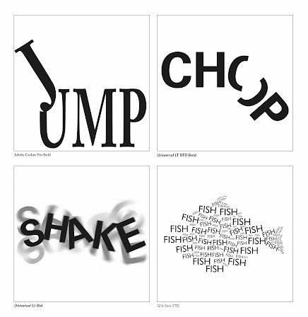
Type Expressions assignment, we were given 4 words; Jump, Small, Chop and Shake. Base our ideas (of the letterforms) with the 10 Typefaces provided for us. Do not do any major distortion on the letterforms and no color, just black and white.
a) Type Expression
- Use appropriate typeface and compose the letters in a manner that allows the word to be what it expresses — still and in motion.
Learning Goals
- To be able to compose and express using textual information.
- To be able to format text for effective communication.
Timeframe: Week 01 - Week 05
3. PROCESS OF WORK
3.1 RESEARCH
Exercise 1
I started off by researching the words individually and went through the photos, to see what I could express in words that correlated with them. I then created a collage with photos I had collected.
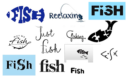
Figure 3.1.1 References I have picked throughout my research. Week 1 (23/09/2024)
Jump [ juhmp ] Verb (used without object)
- To spring clear of the ground or other support by a sudden muscular effort; leap: to rise suddenly or quickly.
Shake [ sheyk ] Verb (used without object), shook, shak-en
- To move or sway with short, quick, irregular vibratory movements. Or to tremble with emotion, cold, etc.
Chop [ chop ] Verb (used with object); chopped, chop-ing.
- to cut or serve with a quick, heavy blow or a series of blows (often followed by down, off, etc.): to make or prepare for use by so cutting.
Fish [ fish ] Noun, Plural (Especially Collectively) fish, fish-es
- Any of the various cold-blooded, aquatic vertebrates, have gills and fins, and typically an elongated body covered with scales.
Exercise 2
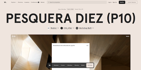
At first, I wasn't sure where to start so I searched up text formatting examples to get an idea of how to do this exercise. After some exploration, I tested out some formatting that I think looks nice to me. I did some further research to explore some text formatting examples, for this specific assignment given. I analyzed how the text should be placed and took care of the neatness.
Figure 3.1.3 References of text formatting layout. Week 5 (14/10/2024)
I watched the tutorials given and followed it by trying out my own text formatting.
Figure 3.1.4 My work in progress. Week 5 (14/10/2024)
I've created four different ideas to explore and see what I like the most. I just played around with looks and fits with the text.
3.2 IDEAS
Exercise 1
Before using Adobe Illustrator CC, we need to do a few sketches of the words that were given to see what would work well with the word. Also, the lecturer to approve which one can be used before digitizing the sketches. This was the first set of sketches that were not approved.
Figure 3.2 Sketches draft. Week 1 (23/09/2024)
The class has had trouble figuring out how to express the word 'small' and most likely everyone had the same type of expression. So, we decided to change it to 'fish' as it would be easier to express. These are the more recent sketches.
Figure 3.3 Sketches with the word fish. Week 1 (23/09/2024)
This is my work in progress when digitizing the sketches. It wasn't my first time using Adobe Illustrator so I had a little knowledge of it, but I just played around with what I could do with my sketches. I explored some of the different typefaces with each word to see if they played nicely with the typeface.
Figure 3.4 Digitizing the sketches. Week 2 (30/09/2024)
Figure 3.5 Finalized 4 type expressions. Week 2 (30/09/2024)
After my 4 type expressions were digitalized, I moved on to picking a work I wanted to animate.
I thought about doing fish but I think I would have a hard time animating how the hook would take the letter H. At the end I chose the word 'jump' and I thought of ways that I could animate it.
My thought process on doing this animation was, that the letter J is jumping onto a platform for example, like jumping onto something bouncy. I also made the letter U make it seem like its a soft surface to make the jump look nicer.
Figure 3.8 Jump Animation in GIF. Week 3 (07/10/2024)
Exercise 2
When having a 9pt size, you have to check the number of characters in that column, which has to be between 55-65. Then you can introduce leading which will be 2 pt larger.
Figure 3.9 Name without kerning. Week 5 (14/10/2024)
Figure 3.9 Name with Kerning practice. Week 5 (14/10/2024)
Final Text Formatting Layout
HEADLINE
Typeface: Bembo Std (Extra Bold)
Type Size/s: 66 pt
Leading: 0 pt
Paragraph spacing: 0
Paragraph spacing: 0
BODY
Typeface: Bembo Std
Type size: 11 pt
Leading: 11 pt
Space after: 10 pt
Alignment: left justified
Margins: 45 mm bottom, 12.7 mm top + right + left
Columns: 4
Gutter: 5 mm
Figure 3.10 Experimenting with text formatting. Week 5 (14/10/2024)
Figure 3.11 Final text formatting. Week 5 (14/10/2024)
Figure 3.12 Final text formatting with visual gridlines in PDF. Week 5 (14/10/2024)
Figure 3.13 Final text formatting layout with gridlines in PDF. Week 5 (14/10/2024)
4. FEEDBACK
Week 1:
- Specific feedback: Not much feedback was given as it was the first week.
- General feedback: Briefed through the MIB and rules advice instruction, which Ms.Vitiyaa explained more clearly to us. The class overall went smoothly and we knew what to give in by next week.
Week 2:
- Specific feedback: The sketches that I did didn't show that much of an expression, as I did struggle a little on the previous word we had which was small. It is my first assignment so there was a little struggle on how to find ways to express the words
- General feedback: Cleared through all the sketches and then had to think of a new word to replace with small. Ms. Vitiyaa was clear about what we had to do for next week.
Week 3:
- Specific feedback: Started learning how to animate on Adobe Illustrator by using artboards. Had to choose one of the 4 words that I digitalized. I personally find it enjoyable to do and had to explore ways to make the word work.
- General feedback: During the class, the lecturer just told us what has to be done for week 3. Everything went by smoothly and I understood what to give in by next week, which was a completed animation of the text.
Week 4:
- Specific feedback: The word 'fish' is distorted and it uses an extra object. It should just be with the letters itself.
- General feedback: The 4 words that we digitized last week turned out to be more distorted than it should have been, and minor fixes are to be done. Watched the pre-recorded which is Typo_2_Basic for the lecture.
Week 5:
- Specific feedback: Need to lessen the hyphenate on the paragraphs, and make it look neater. The golden ratio on my work is fine.
- General feedback: Followed the examples given on MS teams so it didn't make sense when trying to format it in InDesign. Managed to complete the assignments in time. Make sure to update everything in the E-Portfolio.
5. REFLECTION
Experience:
At first, I wasn't sure what the class was going to be like, but throughout the week I understood by reading the MIB and watching all the pre-recorded videos for lectures. I know the basics of Adobe Illustrator so far, as well as learning to explore different ways to enhance an assignment. Also used InDesign for the first time and it's pretty straightforward to understand. At first it was unusual for me to go through pre-recorded lectures, but it has helped me improve in being discipline in keeping up with each lectures. So far, I barely had any struggles in completing the task assigned to us, and got to speed up my creative thinking for ideas.
Observation:
I had to take a look at examples of my classmate's work so I have a clear idea of what I want to do for each assignment. By looking through other peoples work has gave me motivation to do mine in a better way as well. I've come to notice that most of my work is either to simple or I haven't done enough sketches to finalize an exercise. When doing tasks, I had to look through Pinterest to gain ideas and explore more on different ways to elevate my work.
Findings:
I've noticed that Adobe Illustrator isn't that complicated to use after watching many tutorials. There's more information typography than expected, and I feel like I still have lots to learn in the future. I figured that doing more readings can possibly help in doing your work, the more knowledge gained from it you know what to do next, instead of being stuck. Doing research in what the tasks is about has made it easier for me to understand the type of findings i need to look for.
6. FURTHER READING
Figure 6.2 Anatomy of letterforms.
The anatomy of letterforms has helped me understand more about how letterforms are like.
Figure 6.3 Exercise for alignment.
The alignment helped me understand more on the text formatting assignment (Week 5).
Figure 6.4 Understanding kerning.
This page was to understand more about kerning and how to use it properly. It talks about the page layout program and mentions a well-designed typeface that could suit the designs I'm doing in the week 5 task.


.jpg)


Comments
Post a Comment