Project 2 / Website Redesign Prototype
20.11.2024 - 7.11.2024
Diane Sani Alexander Wan / 0378712
Interactive Design / Bachelor of Design (Hons) in Creative Media
Project 2: Website Redesign Prototype
1. INSTRUCTIONS
2. PROCESS OF WORK
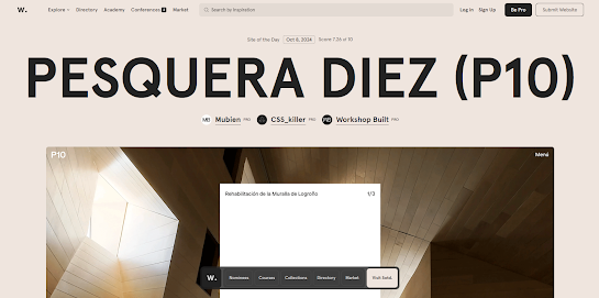
I started off with looking at different examples on what websites I want to go for. So I created a reference board with different type of nature related websites that would help me enhance my website. The style I was going for was mostly modern and clean.
Here are some references that I looked up to inspire me for my final project. The reason to why I picked a nature like theme it's because the website I chose to redesign is based off nature and I thought it would fit the theme so well and make the user understand better on what website their entering.
Figure 2.1 Reference board.
For the colour scheme, I decided to go for earthy tones to match the vibe and feeling of nature since the website I'm doing about is based on nature. Something that is neutral also gives off the feeling of being calm and earth. These colours have neutral tones that give off warmth and can be served as a backdrop for brighter elements or to make the image look clearer.
Figure 2.2 Colour scheme.
These are the components for buttons to test out first, so I know how I want my clickable links or buttons to look like when creating the final project. Normally in websites the logo is usually used as a button to navigate to the home page, so I decided to do the same thing so it redirects the user to back to the home page instead of pressing the back button. The interactive elements are on all the hero section and shapes as button with gentle hover effects.
Figure 2.3 Prototype for clickable buttons.
This is my overall overview of my redesigned prototype design. My thought process was to create a modern and minimalistic design because the current website had a little non-aesthetic designs well the colours weren't so nice to look at.
Figure 2.4 Overall view of prototype in figma.
I kept most of the shapes the same like I used rounded corners and squares to keep up with the theme and also the whole website would look neat that way. There is also an image carousel on page 3 where it shows a few images of the wildlife animals to showcase all animals based in Sarawak. Keeping the consistency of every page with the same shapes makes the whole look neater and know you're under the same website.
For the typography I used 2 fonts from google fonts and they were; DM Serif Display and Outfit. Having more than 2 fonts will feel too overwhelming and not fit the neat theme. I chose these fonts because it looks easy to read and neat, as well as bring a modern touch to it.
A website about nature should feel like capturing a feeling of the outdoors and has visually calming design that reflects the nature. I used a white background to brighten the whole page and I though it would pair nicely with the earthy tones. With vibrant images should make the users feel welcomed in a way.
3. REFLECTION
Experience: At first I knew the basics of Figma and didn't really go in depth into it, but after spending hours playing around, I got the hang of it and learnt so much from tutorials and gained knowledge. I think figuring out how I want the overall website to look like was a fun process as I can make it however I want it to look like. I enjoyed the process of figuring out the design process and creating simple components for buttons.
Observation: I looked at many examples on the internet and on Pinterest and search minimalistic designs for nature website. I placed different images in different shapes to see what would look good. There was a lot of trial and error in this process, but at the end I got what I wanted.
Findings: There's some things that I've noticed on this website is that its user-friendly, with its clear navigation, the only downside is the overall design and aesthetic. There are contact details to help the parks or wildlife if users decide to cooperate with it.


Comments
Post a Comment