Interactive Design - Final Compilation & Reflection
2.09.2024 - 30.12.2024 (Week 1 - Week 14)
Diane Sani Alexander Wan / 0378712
Interactive Design / Bachelor of Design (Hons) in Creative Media
Final CompilationINSTRUCTIONS
FINAL PROJECT
To proceed with the final project, we were instructed to do the planning before hand and search of what website to redesign.
Topic: Sarawak Foresty Corporation
I started off with research on how I want to redesign the website. By doing in depths research and inspiration on ideas. I collected a few photos on the internet to gain some more knowledge on what I want.
I redesigned the site by making a prototype on Figma, so I have a rough idea on how I want the website to look like. Then make sure it was approved before I move onto the html and css to creating the website. By researching and learning more about html and css, I have gained a good amount of knowledge on it as I have never learned anything about it before. I did struggle a bit on how to
Here are some visual references for my site.
The color scheme I decided to go for is more of a nature themed, although on my website I mainly went for white as the background I only implemented the colors on buttons or when it's hovering. Though the images I picked mostly gives off the color scheme I picked.

Figure 1.1 The color scheme made for my website.

Figure 1.2 Inspiration board.
I had the idea to go for nature look because it will enhance everything that will be shown on the website.
Key features:
- The homepage is meant to great the user with a visually captivating banner titled 'Totally Protected Area" to indicate that this sites focus on the environment on nature. With the background being a forest in Sarawak.
- There is an "About Us" section that describes about the Sarawak Foresty Corporation and what their main focus is on.
My work in progress for the html and css:

Figure 1.3 The nav bar for my site.

Figure 1.4 The bar when in site.
The navigation bar is meant to be simple so its easy for the users to look around and search for. The Donate button is on every page in the navigation bar, for cases where the users have the need to donate.

Figure 1.5 The css on the nav bar.
The first page; Something I couldn't understand how to structure the HTML and CSS on the parts where the website parts were supposed to overlap. Such positioning and styling where elements are on top; for example, the 'About Us' text box which is on the background image, is quite exacting. Responsiveness was not easy to balance in order to make the design appear the same on different screen sizes.


Throughout this process I learnt how to use relative and absolute positioning, and having to deal with z-indexes for layer arrangement, was a bit hard. These parts that overlapped were necessary in enhancing the view, but making them proper was only possible after considerable trial and error.
Areas for improvement:
- Probably incorporate more interactive features, such as virtual tours or booking options for park visits.
- Add a section for recent news or conservation success stories to keep the site dynamic and updated.
- Make the spacing more equal and the shapes all should equally look the same.
- The navigation bar could be more prominent. By using a larger font size or a different color to make it stand out.
On this second page, is was more for the parks side, to entertain those who want more knowledge on the parks in Sarawak. I tried to keep the theme up by keeping the border-radius all equal so there wouldn't be any off putting looks.

Figure 1.8 Second page of the website.

Figure 1.9 html for second page.
Key features:
- The images picked out needs to all be the same size so as soon as a user clicks, it shows a clear image on what Sarawak parks may have.
- The content being clearly segmented. With individual sections and calls to action like "Donate". This ensures a easy navigation to users.
Areas for improvement:
- Adding interactivity, such as hover effects or animations, could enhance user engagement further.
- Making the "Donate" button align with the rest of the text, but as of right now it looks off.
- A more dynamic navigation menu, with dropdowns or animations, could add a modern touch to the design.
- The spacing between images and text box looks far apart.
Third page is mostly images to showcase more on the wildlife side of Sarawak. So I tried putting a carousel for images, but I had issues on it and it wouldn't appear as a carousel, so I decided to make the images into card sections and show the different type of animals.
I mainly struggled on making the card, but I figured that I need to take care of the padding and margins sizes as they could affect a tiny bit of the images.

Figure 1.10 Third page for the website.

Figure1.11 html for third page.
- The layout is simple and intuitive with a clear distinction between text and images.
- Images are big and clear to tell what animal is being displayed.
Areas for improvement:
- Adding interactive elements on the cards, like when you click it it shows more information about the animal or adding a few information's below the card too.
- The "Protected Animals" section can be made more dynamic like clicking each animal with detailed species profile.
- Including more data on conservation initiatives or success stories would further inspire user participation and donations.
Fourth page, which is the contact page is used to ask for information about the nature of Sarawak.
There are a few text boxes there like first and last name and email to get back to the user. Additional notes if they have anything to add onto. I embedded a map of where the office is located for users to know or visit the place.
I struggled of the text box of where the text is supposed to be at. The spacing between them couldn't space between them.

Figure 1.12 Contact Us page.

Figure 1.13 html of the contact page
Key Features:- Required fields are clearly marked with an asterisk (*), guiding users to complete the essential information.
- The soft green color palette aligns with the organization’s environmental mission, reinforcing its identity as it fits the theme.
- The "Contact Us" heading is prominently displayed in a large, bold font, ensuring the section's purpose is immediately clear.
- The embedded map of Kuching provides geographic context, helping users understand the location of Sarawak Forestry Corporation and its proximity to landmarks.
Areas for improvement:
- Adding validation messages for incomplete or incorrect inputs in the form would improve user experience.
- Including alternative contact options, such as phone numbers or a direct email address in this section, would cater to users who may prefer other means of communication.
- The spacing on the text box should be figured out.
The Donate page when wanting to donate. I gave it the simple design as the donate page is meant to be straight forward for the users to understand. It has the amount you want to donate.

Figure 1.14 The fifth page design.

Figure 1.15 hmtl for fifth page.
- The hornbill image as the main focus to know what users are donating for.
- The simplicity design for donation page.
Areas for improvement:
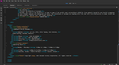

This is the css I created for most of the navigation bar throughout the pages. One thing that I tried fixing the logo being stuck tot he top left corner to keep the visually aesthetic of the website.

This is the css for the footer, I think its almost similar to the way I wanted it too look. There were some issues where the title of the footer wont get in place, like left alignment, but after some fxing with the margins, it manages to move.
- To make the website responsive with different devices.
- The website lacks substantial content. So by adding information about the organization, its mission, and the impact of donations would enhance user engagement.

Figure 1.16 hmtl for the footer.
The only issue with the footer is the "corporate office Kuching" should be centered, but it didn't really work on my end, but it still looks like the way I wanted it to look like. I followed the color scheme to make it fit the theme for my website, which has earthy tone to it.

Figure 1.17 The css for the navigation bar.

Figure 1.18 The css for footer.
The link to the redesigned final project: https://dianewan-finalproject.netlify.app/?authuser=0
REFLECTION
Experience:
Throughout this 14 weeks on interactive design I learned a lot of new things and experienced new things as well. At first I wasn't sure on how I'm going to make it through the class but with loads of research and learning, I gained some useful knowledge that will help me work through the final project. Understanding html and css as someone who's new to it sounds intimidating, but I made it through with watching a few videos about it. This module has taught me a lot and hope it is useful for future lessons. I am grateful to have learnt something in interactive design and hope to improve my skills. I did struggle a bit and was confused most of the time but I overcome all the issues by asking the internet as it can useful for some small problems.
Observation:
The way I also learnt is by looking at my classmates work as well as asking them for any help for some parts I didn't understand. By searching up inspiration on designs for websites also helped a lot in terms of motivation to get new ideas. Watching a bunch of videos on youtube to help me through as well for minor issues that weren't working on my end.
Findings:
I find doing interactive design very interesting, although it is hard for someone who's never touched html and css, it was a good learning process for me. I hope this opportunity would help me with future upcoming assignments. With a lot of knowledge gained in this final project, I could further improve the website i built on my free time to educate myself a lot more.


Comments
Post a Comment