Typography Task 2: Typographic Exploration & Communication
28.10.2024 - 21.10.2024 (Week 06 - Week 07)
Diane Sani Alexander Wan / 0378712
Typography / Bachelor of Design (Hons) in Creative Media
Task 2: Typographic Exploration & Communication1. LECTURES
Refer to Task 1
2. INSTRUCTIONS
<iframe src="https://drive.google.com/file/d/1-F6GsP6UpMEkMy1QJZS-obz5wSiPl3Yd/preview" width="640" height="480" allow="autoplay"></iframe>
Task 2: Typographic Exploration & Communication (20%)
In this task you will be asked to express typographically the content in a 2-page editorial spread.
Learning Goals
- To demonstrate the use of grids and understanding the layouts and page flow.
- To apply the skills learnt for an effective typographic communication and achieve a good reading rhythm.
Timeframe: Week 06 - Week 07
3. PROCESS OF WORK
WEEK 6
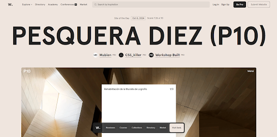
I started finding for a few references on the internet on, editorial spread, and find what I find inspiring and then work from that.
WEEK 7
I Started off on Adobe Illustrator to do the design for the first page to the spread. Then I played around with what I liked. After that I exported it and then put it in InDesign to add on text.
Figure 3.2 The first 2 of ideas. Week 7. (5/11/2024)
Figure 3.3 Other ideas. Week 7. (5/11/2024)
After many exploration, I have decided to pick this one, because it seems to have the nicest layout out of all the others, as well as, it has a neat title the spreads out. After many adjustment with the text formatting, I had to look for minor issues in it.
Figure 3.6 Final editorial Spread in PDF. Week 7. (5/11/2024)
4. FEEDBACK
Week 6:
Specific Feedback: I should reduce the hyphenate on the sentences, but overall it has a fine golden ratio.
General Feedback: Make sure we get done with the e-portfolio by the end of the day and refine and more assignments.
Week 7:
Specific Feedback: My work has too many hyphens in them need to lessen them. I need to pay more attention to the kerning and leading in order for my text to look more neater. The headline is fine, it's just mainly the text formatting. To not have lots of empty spaces.
General Feedback: Kerning and leading is a problem. It is inconsistent through out the entire text.
5. REFLECTION
Experience: At first I wasn't sure on how to start, but after many research on examples of editorial spreads, I had an idea of how to make the spread look readable. I had trouble thinking of ideas to make and in what way to format the text. I wasn't sure on how to proceed, but after a lot of researching and understanding I managed to get it done in time.
Observation: After looking through many examples on the internet as well as looking at my classmates work, I realized that the kerning and leading spaces were inconsistent thought out the assignment. I need to have a better understanding on text formatting and make it look neater.
Findings: To have a better read on more books on typography. I have to understand a in depth detail of the text formatting, because sometimes I rarely pay attention to smaller details of text, like spacing. I tend to do better on bigger headings and utilizing the space to make it look nice. Sometimes the font size can be a little big for text formatting, and learning which size to make the text look neat.
6. FURTHER READING
Typographic Design: Form and Communication


Comments
Post a Comment